Lucky Punch
Odvažan identitet brenda preveden u digitalni nastup snažnog učinka
- Web-dizajn
- Brendiranje
Pregled
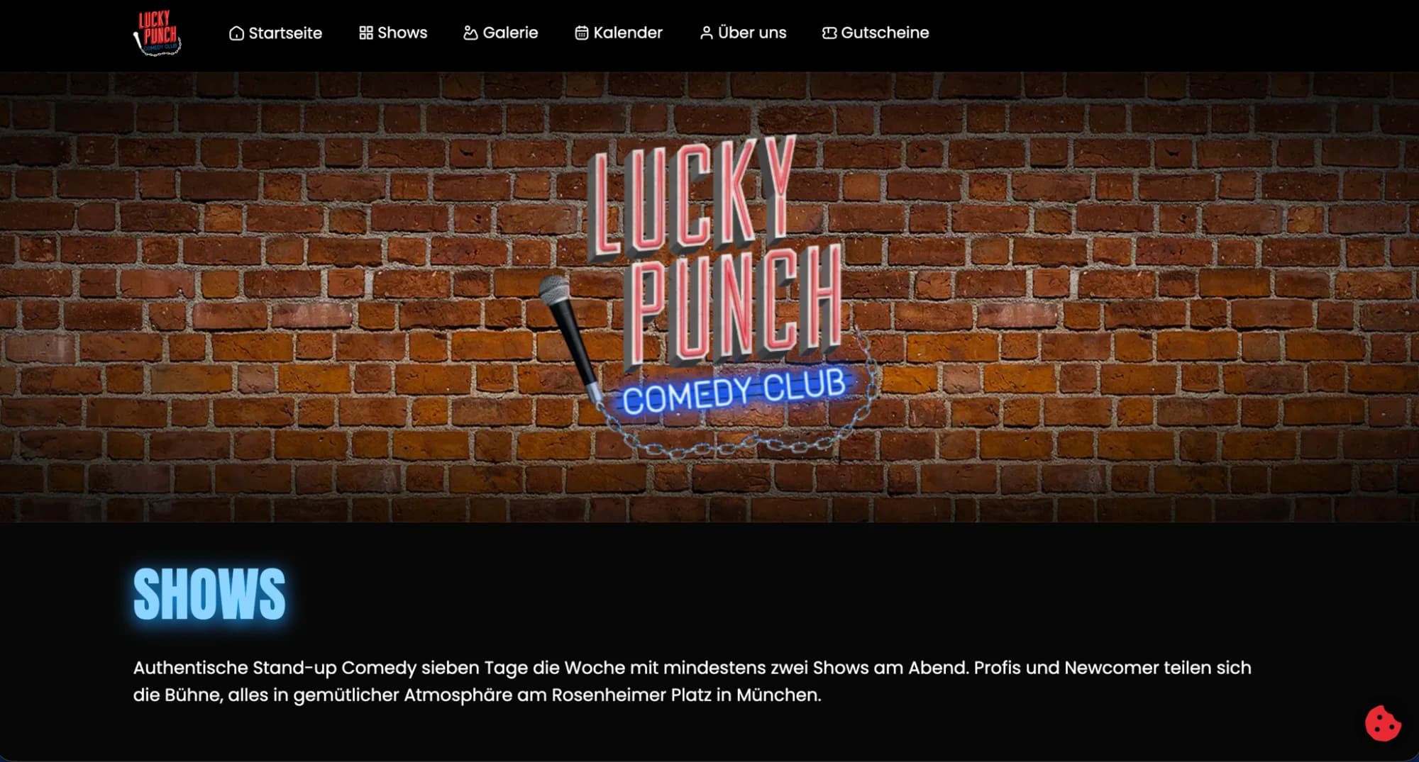
Lucky Punchu je trebalo digitalno iskustvo dostojno energične ličnosti brenda — takvo da suštinu prenese u prvih nekoliko pomaka ekrana, a ostane pregledno i usmjereno na konverziju.
Izazov
Dizajn visoke energije često se sudara s upotrebljivošću. Rizik je bila vizuelno upečatljiva stranica koja korisnike funkcionalno frustrira. Cilj: zadržati intenzitet brenda bez žrtvovanja jasnoće navigacije i učinkovitosti konverzije.
Rješenje
Pristup počiva na kontroliranom kontrastu — odvažna tipografija i fotografija u hero i prijelaznim sekcijama, uparene s čistim, svedenim sadržajnim zonama. Taj ritam isporučuje vizuelni udar na početku, a angažman dalje teče neometano, uz direktnu i nedvosmislenu navigaciju.
Rezultati
- Puna energija brenda od prvog trenutka, uz trajnu upotrebljivost
- Identitet prenesen u sekundama, interes pretvoren u akciju
- Tipografski sistem s promišljenom hijerarhijom
- Konverzijski usmjerena struktura ispod vizuelne smjelosti
- Mobile-first responzivni dizajn na svim širinama ekrana
Analiza putanje korisnika
Korisnik: Potential collaborator or brand partner discovering Lucky Punch
Heard about Lucky Punch from an industry contact — arrives with genuine curiosity
First viewport delivers brand energy immediately — no loading intro screens or animations that delay
Bold hero typography communicates personality in under 3 seconds
Typography-driven design means brand registers before any body copy is consciously processed
Scrolls to understand what Lucky Punch actually does and offers
Content sections alternate high-energy and structured — rhythm prevents visual fatigue on scroll
Looks for work samples and proof of quality
Work section uses full-bleed samples — visual quality speaks before any description text is read
Finds contact easily — reaches out without friction
Navigation visible on scroll at all times — contact is never more than 2 clicks from any position
UX artefakti
Brand Energy vs. Usability Balance
- Brand intensity
- High — full-viewport heroes, bold type, maximum contrast
- Risk identified
- High-energy aesthetic can create navigation ambiguity
- Mitigation 1
- Sections alternate: hero (brand energy) → structured (information)
- Mitigation 2
- Navigation pinned on scroll — visible at all times regardless of scroll position
- Mitigation 3
- Single CTA per section — no competing actions competing for attention
Conversion Structure Beneath the Visual Boldness
- Above fold
- Brand establishment — no CTA (premature ask loses trust)
- Section 2
- Positioning — what Lucky Punch does — light CTA: 'See our work'
- Section 3
- Work samples — mid-funnel interest — CTA: 'Tell us about your project'
- Section 4
- Credibility signals — social proof without an awards-page feel
- Footer
- Direct contact — for visitors who have already decided
sljedeći projekat →
Zicer
Bosanski digitalni proizvod redizajniran oko stvarnih potreba korisnika