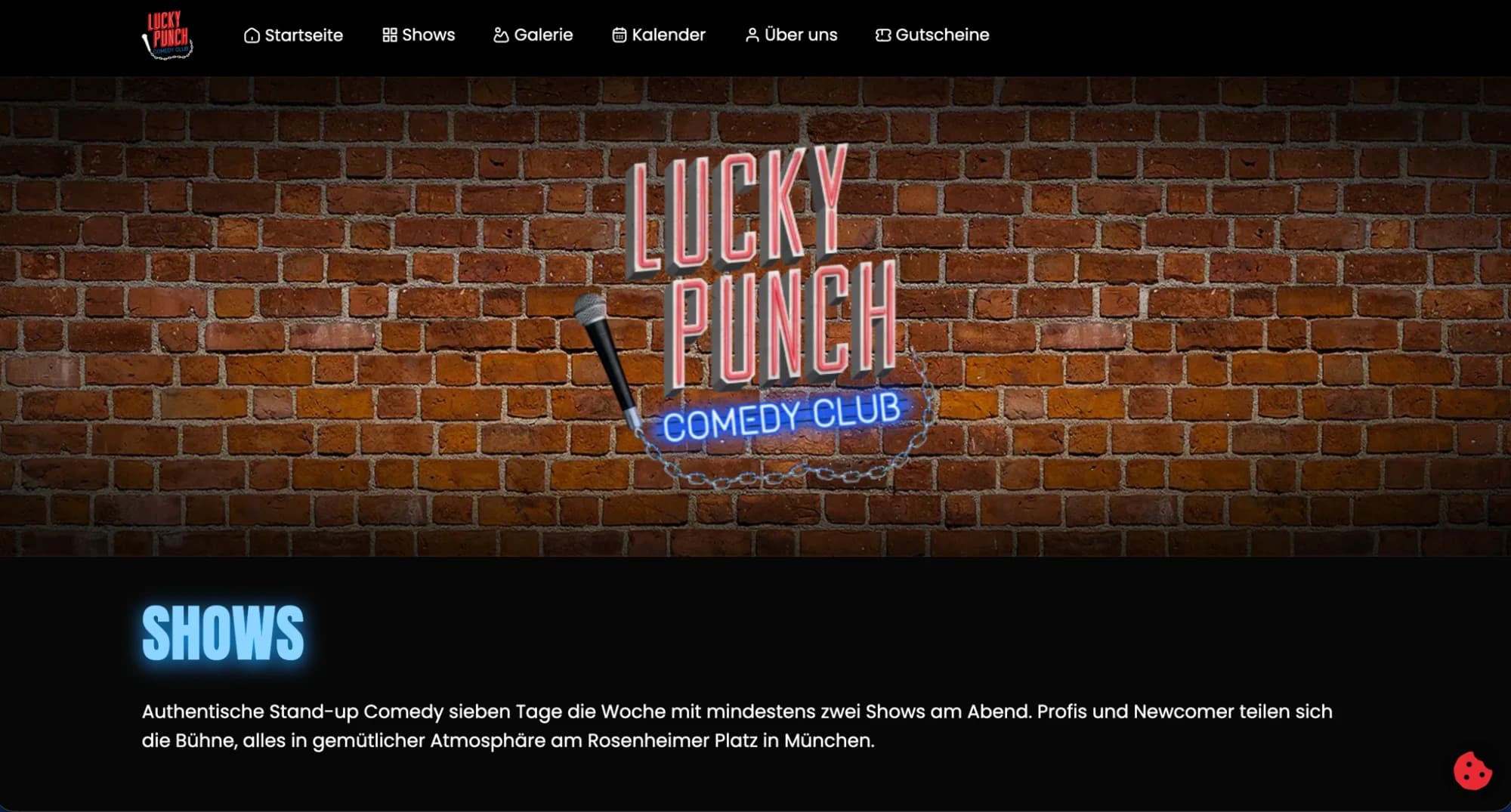
Lucky Punch
A bold brand identity translated into a high-impact digital presence
- Web Design
- Branding
Overview
Lucky Punch needed a digital experience that matched its energetic brand personality — conveying the brand's essence within the first scrolls while staying navigable and conversion-oriented.
The challenge
High-energy designs often conflict with usability. The risk was a visually compelling site that frustrates users functionally. The goal: keep brand intensity without sacrificing navigation clarity or conversion efficiency.
The solution
The approach used controlled contrast — bold typography and imagery in hero and transition sections, paired with clean, minimal content areas. That rhythm delivers visual impact upfront while keeping engagement seamless, with direct, unambiguous navigation.
Outcome
- Full brand energy upfront with sustained usability
- Communicates identity in seconds, converting interest to action
- Typography-driven system with deliberate hierarchy
- Conversion-focused structure beneath the visual boldness
- Mobile-first responsive design across breakpoints
User Journey Analysis
Actor: Potential collaborator or brand partner discovering Lucky Punch
Heard about Lucky Punch from an industry contact — arrives with genuine curiosity
First viewport delivers brand energy immediately — no loading intro screens or animations that delay
Bold hero typography communicates personality in under 3 seconds
Typography-driven design means brand registers before any body copy is consciously processed
Scrolls to understand what Lucky Punch actually does and offers
Content sections alternate high-energy and structured — rhythm prevents visual fatigue on scroll
Looks for work samples and proof of quality
Work section uses full-bleed samples — visual quality speaks before any description text is read
Finds contact easily — reaches out without friction
Navigation visible on scroll at all times — contact is never more than 2 clicks from any position
UX Artifacts
Brand Energy vs. Usability Balance
- Brand intensity
- High — full-viewport heroes, bold type, maximum contrast
- Risk identified
- High-energy aesthetic can create navigation ambiguity
- Mitigation 1
- Sections alternate: hero (brand energy) → structured (information)
- Mitigation 2
- Navigation pinned on scroll — visible at all times regardless of scroll position
- Mitigation 3
- Single CTA per section — no competing actions competing for attention
Conversion Structure Beneath the Visual Boldness
- Above fold
- Brand establishment — no CTA (premature ask loses trust)
- Section 2
- Positioning — what Lucky Punch does — light CTA: 'See our work'
- Section 3
- Work samples — mid-funnel interest — CTA: 'Tell us about your project'
- Section 4
- Credibility signals — social proof without an awards-page feel
- Footer
- Direct contact — for visitors who have already decided
next frame →
Zicer
A Bosnian digital product redesigned around real user needs