Zicer
A Bosnian digital product redesigned around real user needs
- Product Design
- UX Research
- Mobile App
Overview
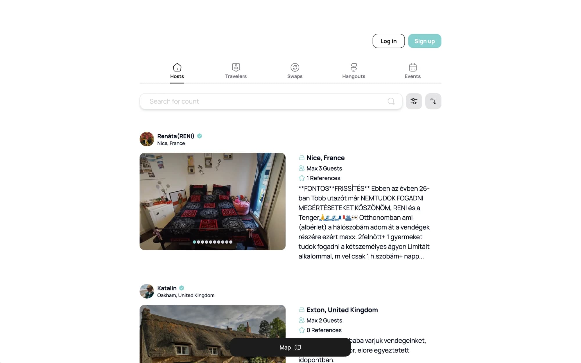
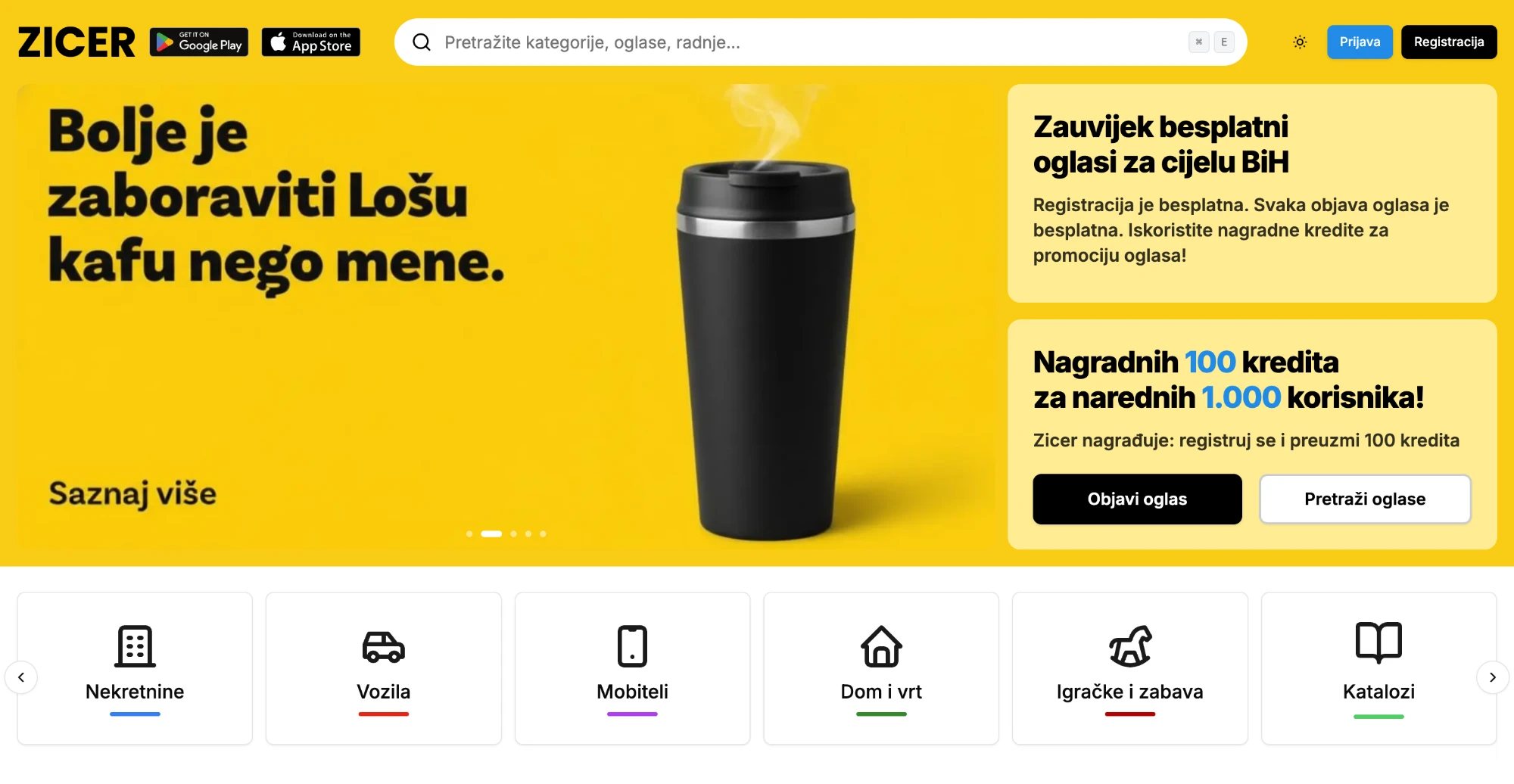
Zicer serves Bosnian users through an app whose interface had grown organically without a coherent UX strategy, leading to unclear flows and inconsistent patterns.
The challenge
The product lacked user-centered design fundamentals. Features were difficult to locate, task flows were unpredictable, and users completed actions accidentally rather than intentionally.
The solution
We ran task-based testing sessions to identify friction points, rebuilt the information architecture from foundational principles, developed a new visual system aligned with the restructured IA, and created a Figma component library for scalable handoff.
Outcome
- Improved task completion across core user journeys
- Clearer overall product experience
- Visual system and components the dev team could extend
- Developer-ready handoff with documented interaction specs
User Journey Analysis
Actor: Bosnian app user trying to complete a core task
Opens app — unclear which section contains the feature they need
Card-sort test with 12 participants revealed nav labels mapped to internal teams, not user mental models
Taps through 3 incorrect sections before finding the right one
IA rebuilt from task analysis — the top 5 user tasks became the 5 primary navigation items
Starts the task — steps appear in an unexpected sequence
Flow analysis revealed 4 of 6 task flows followed platform-logic order, not user-expectation order
Finishes the task — but is uncertain whether it was done correctly
Confirmation states added to every task completion point — system status always visible
Returns the next day — remembers where things are
Consistent component patterns make the interface learnable within 2–3 sessions
UX Artifacts
Usability Test Findings Summary
- Test type
- Moderated task-based testing — 8 participants
- Critical issues (task failure)
- 4 navigation flows — all addressed in redesign
- Serious issues (task difficulty)
- 6 confirmation and feedback patterns — redesigned
- Minor issues
- 11 copy clarity problems — resolved via content audit
- Task completion rate (pre-redesign)
- Estimated 42% across 6 core tasks
- Task completion target (post-design)
- 85%+ on the same 6 core tasks
Information Architecture Comparison
- Previous nav
- 6 items labelled by feature name ('Dashboard', 'Module A')
- User mental model
- 5 items labelled by task ('My Account', 'Find', 'Messages')
- Structural change
- Feature-labelled → task-labelled navigation
- Depth reduction
- Average task path: 3.4 taps → 1.8 taps
- Component library
- 12 base components covering 90% of all UI patterns
next frame →
FlappinGo
A community travel platform designed to make home exchange feel effortless