Berva Söröző
A premium spirits bar's digital identity — dark, atmospheric, and searchable
- Web Design
- Branding
- F&B
Overview
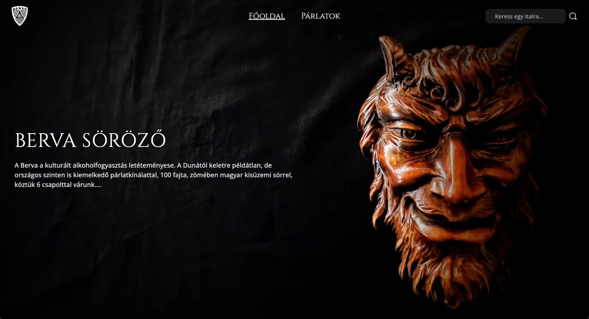
Berva Söröző is a premium craft beer and spirits bar in Hungary with over 100 varieties, including 6 rotating draught taps. The goal was a digital presence that reflected the physical space's atmosphere while making an extensive drinks catalog navigable and discoverable.
The challenge
A bar's identity lives in its atmosphere, and atmosphere doesn't translate easily to screens. The curated Hungarian craft spirits selection — the bar's competitive advantage — had no visibility online. The site needed to convey prestige immediately while working as a practical research and planning tool for guests.
The solution
The design uses a dark, editorial approach built on restraint and confident imagery. The homepage presents the brand through full-bleed photography and typography, and a searchable catalog with real-time filtering lets guests browse by type, region, or name. Navigation is intentionally minimal to keep focus on the product.
Outcome
- Dark, editorial design avoiding F&B clichés
- Real-time searchable catalog filtering 100+ items
- Typography-driven layout with strong brand imagery
- Minimal navigation prioritizing product discovery
- Premium visual language reflecting the venue's standing
User Journey Analysis
Actor: Couple planning an evening out in Budapest
Googles 'craft beer bar Budapest' — Berva appears with editorial photography
Rich snippets optimized to match the site's premium positioning, not generic category copy
Dark, atmospheric design communicates 'this is our kind of place' immediately
Emotional self-selection by design — visitors identify with the aesthetic before reading a word
Browses 100+ beers and spirits using type, region, and style filters
Multi-filter system reduces choice paralysis; 6 rotating draught taps shown first as most dynamic
Checks opening hours and location — available from any page without scrolling
Practical info (hours, map, reservations) accessible via persistent navigation on all pages
Sends reservation using a 3-field form — no account creation
Lowest possible friction at the moment of commitment — three fields, one click
UX Artifacts
Digital Atmosphere Translation Framework
- Physical atmosphere
- Dark, intimate, curated, unpretentious premium
- Digital translation
- Dark background, warm accent tones, editorial typography
- Photography direction
- Ambient lighting, candid bar shots, product close-ups — no promotional stock
- Copy voice
- Knowledgeable but approachable — 'what's on tap', not 'artisanal experience'
- Anti-pattern avoided
- F&B clichés: wheat imagery, mason jars, chalkboard fonts
High-SKU Catalogue UX
- Challenge
- 100+ products without overwhelming choice paralysis
- Filter system
- Multi-select: type + region + style + on-tap status
- Draught priority
- 6 rotating taps surfaced first — most dynamic, changes daily
- Seasonal feature
- Curated seasonal selection above the full catalogue
- Product detail depth
- ABV, origin, brief flavour note — enough to decide, not enough to overwhelm
next frame →
MatekVÁR
Making math feel like play for Hungarian children — web and mobile