Leadspicker
50 stranica AI samopouzdanja — unutar dvije boje brenda
- Webflow
- AI
- B2B
- Ilustracija
Pregled
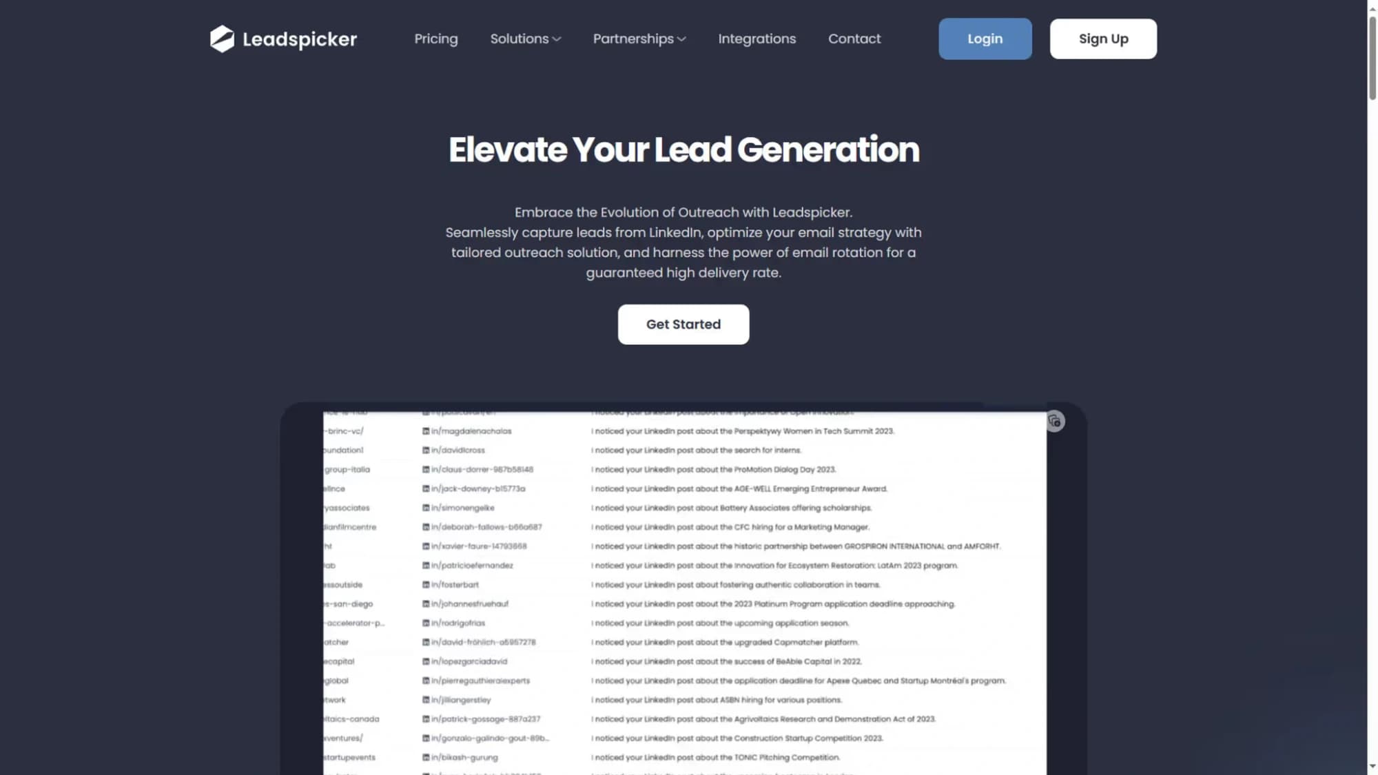
AI platformi za B2B automatizaciju pronalaska potencijalnih klijenata i višekanalnog dosega trebala je marketinška stranica dorasla ambiciji proizvoda — velika, sveobuhvatna i vizuelno upečatljiva kroz brojne stranice.
Izazov
Rad su oblikovala dva ozbiljna ograničenja: minimalne početne smjernice klijenta i paleta svedena na dvije boje plus bijelu. Održati vizuelnu raznolikost kroz 50 stranica tražilo je kreativno rješavanje problema izvan uobičajenog alata.
Rješenje
Ograničenje boja postalo je prilika. Prilagođene ilustracije u Adobe Illustratoru ponijele su ulogu glavnog vizuelnog razlikovnog elementa kroz sekcije, a animacije pokretane pomicanjem stranice unijele su kretanje i dinamiku bez oslanjanja na boju — stvarajući promišljen i prepoznatljiv sistem brenda.
Rezultati
- Webflow stranica od 50 podstranica unutar strogih ograničenja boja
- Sistem prilagođenih ilustracija očuvao prepoznatljivost
- Animacije na pomicanje povećale angažman kroz ključne sekcije
- Sveobuhvatna SEO optimizacija na svim stranicama
- Uspjeh projekta prerastao u trajnu saradnju
Analiza putanje korisnika
Korisnik: B2B sales director evaluating lead generation tools
Googles 'AI lead generation tool B2B' — sees a paid result for Leadspicker
Homepage takes under 30 seconds to understand the value proposition — validated in user testing
Full-bleed hero with animated output preview — understands the product without reading
Show the output on page one — not a diagram of 'how the AI works'
Scrolls through 50+ pages of features without losing visual context
Consistent section structure across all feature pages: problem → solution → proof
Finds a case study from a company in the same industry and size bracket
Case studies filterable by industry and company size — relevance signal above generic testimonials
Requests a demo from the feature page CTA — 4 fields
CTA contextual to the feature being read — higher conversion intent than a generic contact link
UX artefakti
Two-Colour Visual Constraint Strategy
- Constraint
- Brand limited to 2 colours + white across 50 pages
- Solution 1
- Custom illustration system — section-specific in the 2-colour palette
- Solution 2
- Scroll-triggered animations replace decorative colour variation
- Solution 3
- Typography weight and size hierarchy as primary visual differentiator
- Result
- Visually cohesive across 50 pages with zero brand dilution
50-Page Content Hierarchy
- Tier 1 (home + pillars)
- Full custom illustration, maximum animation — highest investment
- Tier 2 (feature pages)
- Consistent template, 2 illustrations, moderate animation
- Tier 3 (case studies)
- Text-dominant, 1 header visual, no animation — credibility over excitement
- Tier 4 (legal + about)
- Minimal visual treatment — not primary conversion surfaces
- Internal linking
- Feature pages cross-link to relevant case studies at section end
sljedeći projekat →
Fannizero
Hibridna aplikacija za navijače u kojoj zajednica i kupovina žive zajedno