Leadspicker
50 pages of AI-powered confidence — built within two brand colors
- Webflow
- AI
- B2B
- Illustration
Overview
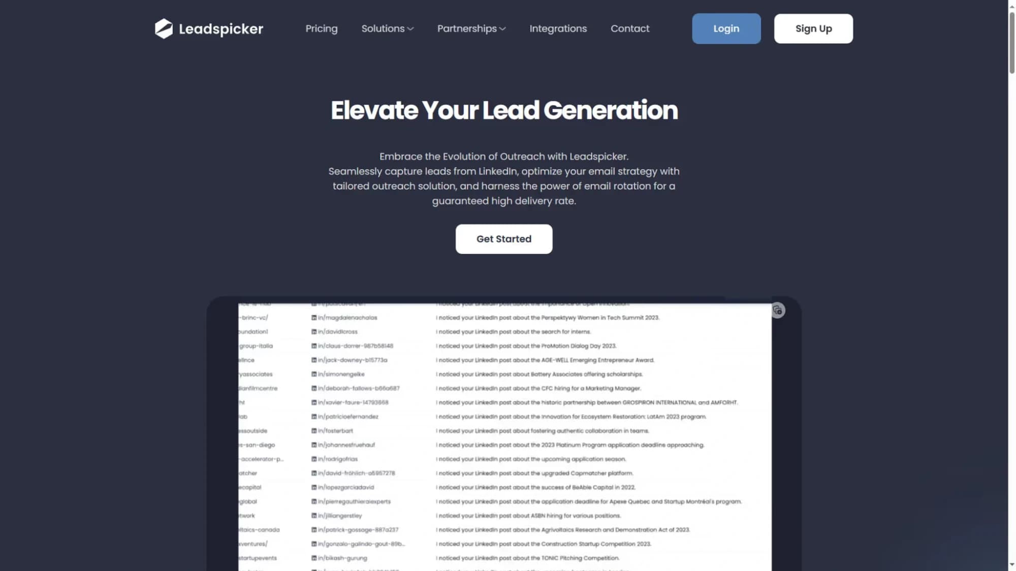
An AI-driven B2B platform automating lead generation and multichannel outreach needed a marketing site that matched its product's ambition — large, comprehensive, and visually compelling across many pages.
The challenge
Two constraints shaped the work: minimal initial client direction, and a palette restricted to two colors plus white. Keeping visual variety across 50 pages required creative problem-solving beyond the usual toolset.
The solution
The color limitation became an opportunity. Custom illustrations in Adobe Illustrator served as the primary visual differentiator across sections, and scroll-triggered animations added movement and interest without relying on color — creating an intentional, distinctive brand system.
Outcome
- 50-page Webflow site within strict color constraints
- Custom illustration system maintaining distinctiveness
- Scroll animations enhancing engagement across sections
- Comprehensive SEO optimization throughout
- Ongoing client collaboration following the project
User Journey Analysis
Actor: B2B sales director evaluating lead generation tools
Googles 'AI lead generation tool B2B' — sees a paid result for Leadspicker
Homepage takes under 30 seconds to understand the value proposition — validated in user testing
Full-bleed hero with animated output preview — understands the product without reading
Show the output on page one — not a diagram of 'how the AI works'
Scrolls through 50+ pages of features without losing visual context
Consistent section structure across all feature pages: problem → solution → proof
Finds a case study from a company in the same industry and size bracket
Case studies filterable by industry and company size — relevance signal above generic testimonials
Requests a demo from the feature page CTA — 4 fields
CTA contextual to the feature being read — higher conversion intent than a generic contact link
UX Artifacts
Two-Colour Visual Constraint Strategy
- Constraint
- Brand limited to 2 colours + white across 50 pages
- Solution 1
- Custom illustration system — section-specific in the 2-colour palette
- Solution 2
- Scroll-triggered animations replace decorative colour variation
- Solution 3
- Typography weight and size hierarchy as primary visual differentiator
- Result
- Visually cohesive across 50 pages with zero brand dilution
50-Page Content Hierarchy
- Tier 1 (home + pillars)
- Full custom illustration, maximum animation — highest investment
- Tier 2 (feature pages)
- Consistent template, 2 illustrations, moderate animation
- Tier 3 (case studies)
- Text-dominant, 1 header visual, no animation — credibility over excitement
- Tier 4 (legal + about)
- Minimal visual treatment — not primary conversion surfaces
- Internal linking
- Feature pages cross-link to relevant case studies at section end
next frame →
Fannizero
A hybrid fan app where community and commerce coexist